
New Sundrift PackView
Wallpapers for people who notice.
Every size composed for its screen, rendered at 6K so nothing bands. Made for desktop, tablet and phone sizes.
On screen
Drawn for the screen it lands on.
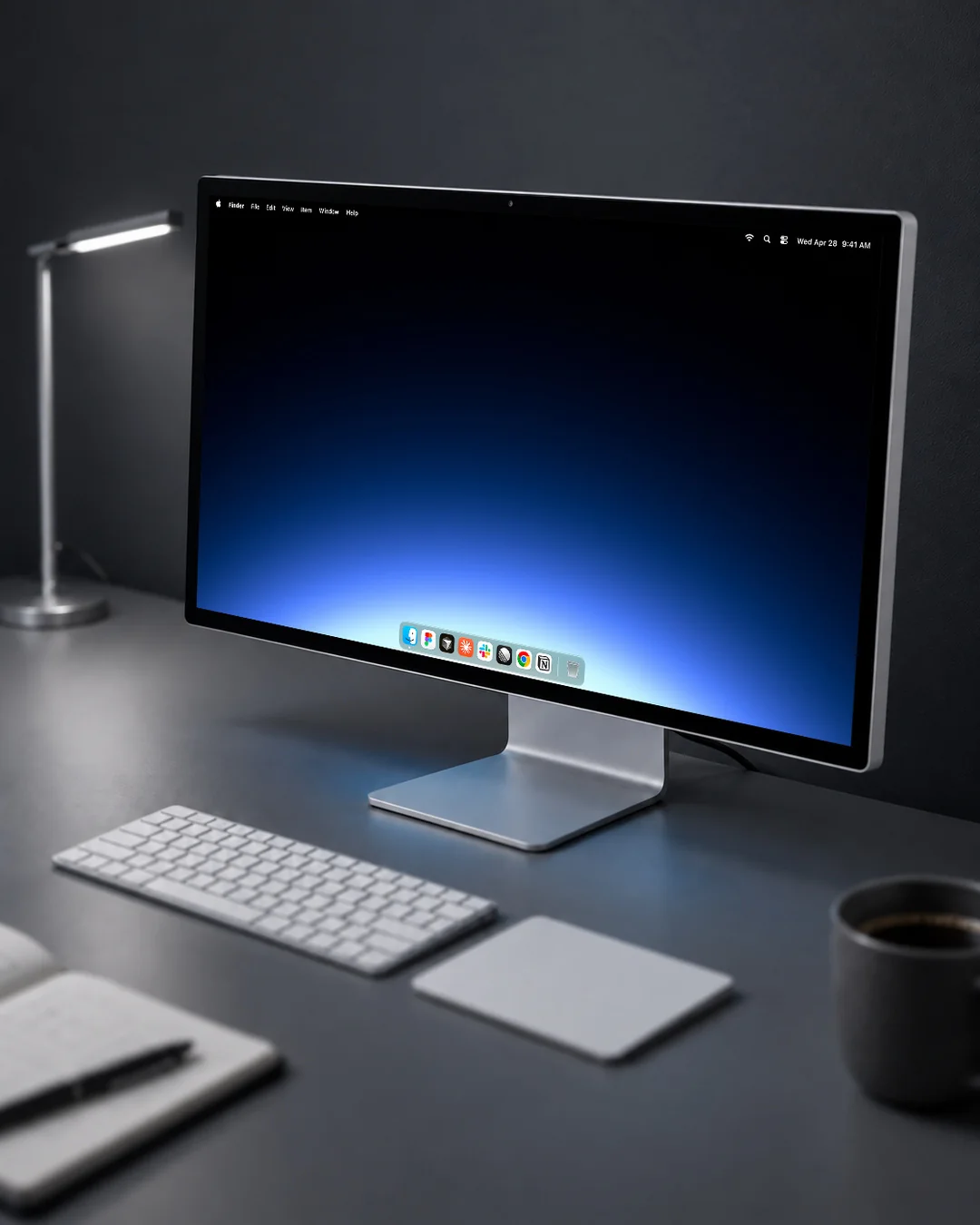
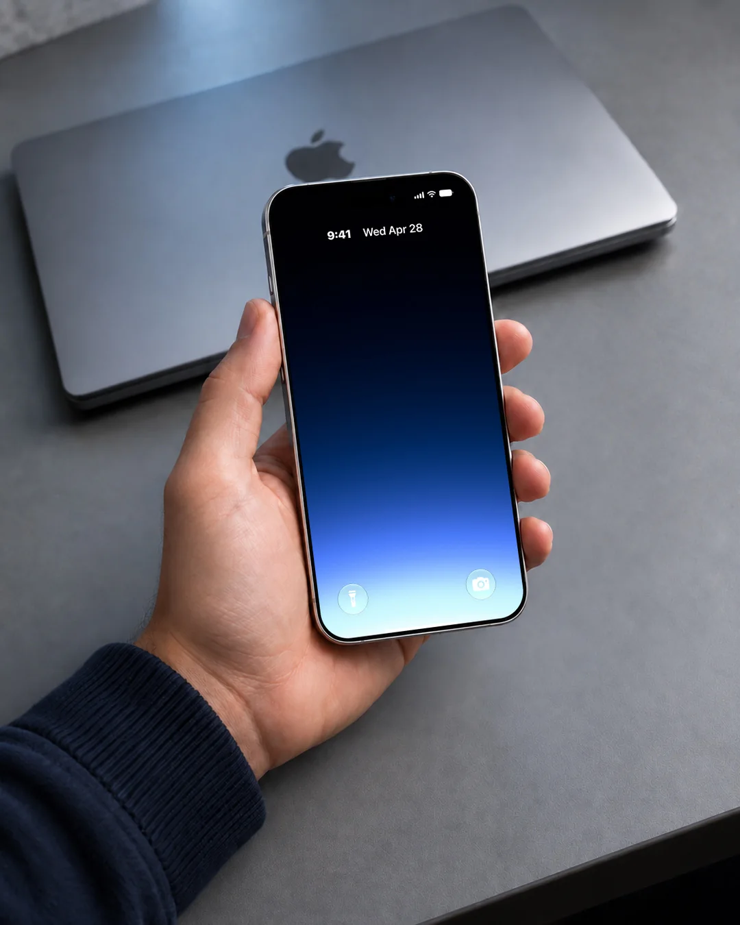
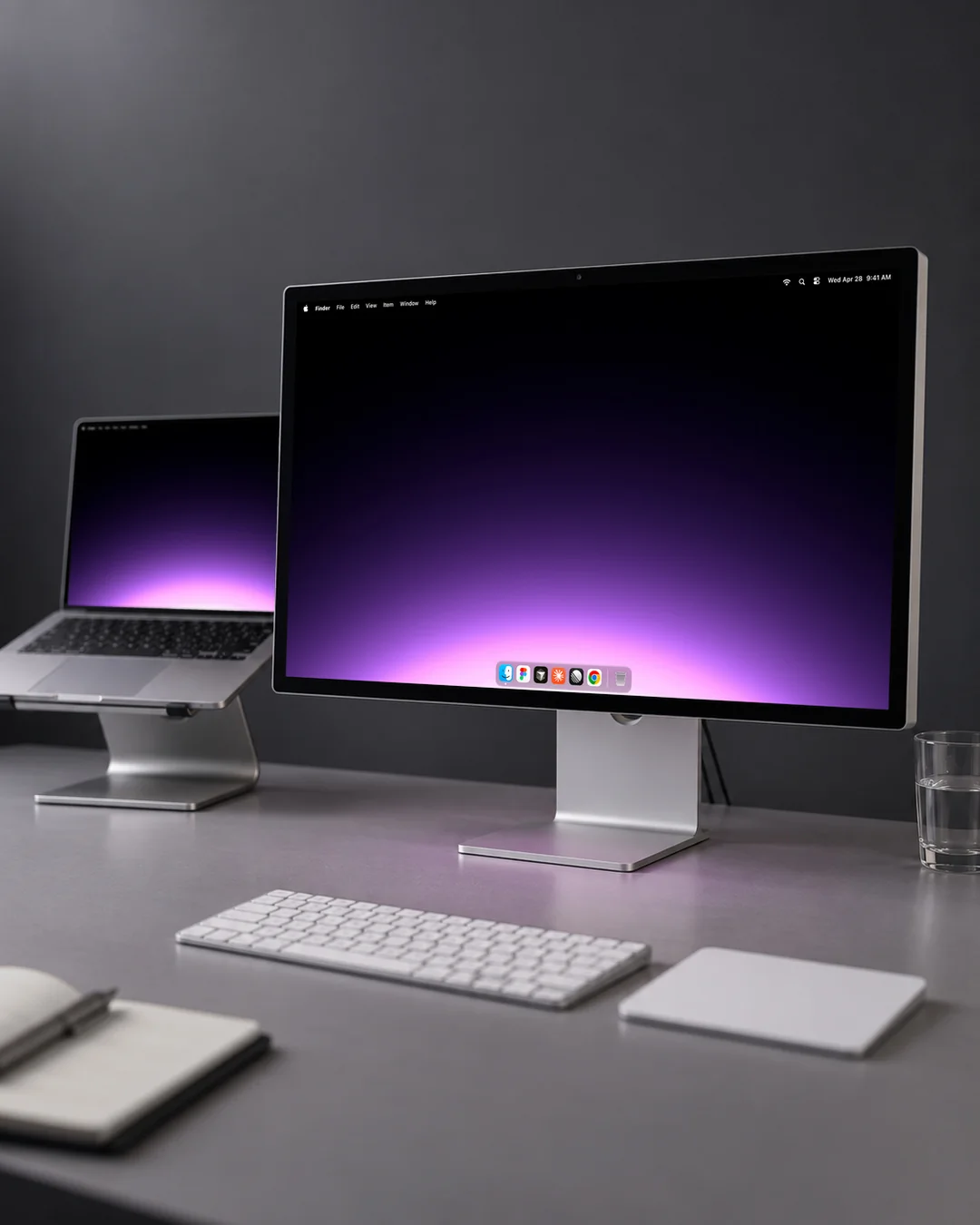
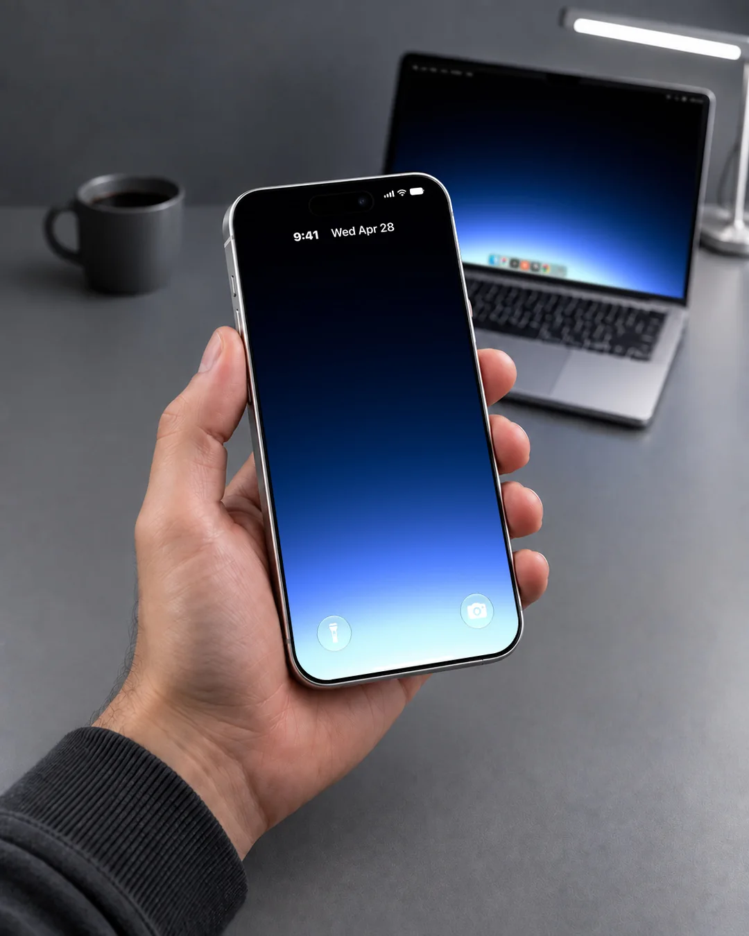
Every shape is composed again rather than cropped down, so a phone is not a squeezed desktop. The free Gradient pack here, on a desktop and in the hand.
The sizes
Every device, its own file.
Each size is reframed, not centre-cropped, so the quiet zone lands behind the menus and taskbar on a desktop and behind the clock on a phone. See which size fits your screen, including the iPhone Duo.
| Device | Pixels | Aspect | Notes |
|---|---|---|---|
| Desktop 6K | 6016 × 3384 | 16:9 | Native on a 6K panel. Scales cleanly to 5K, 4K and every 16:9 monitor. |
| Laptop 16:10 | 5120 × 3200 | 16:10 | The 16:10 laptop shape without letterboxing: MacBook Pro and Air, Surface, XPS, most Chromebooks. |
| Ultrawide | 5120 × 2160 | 21:9 | Native on 5K2K monitors, downscales to 3440 × 1440. |
| Tablet 1:1 | 2752 × 2752 | 1:1 | A square covers portrait and landscape, so one file works on a 13 inch tablet and everything smaller. |
| Foldable Open 10:7 | 2670 × 1878 | 10:7 | The unfolded screen of a book-style folding phone. Landscape, and native at its own size. |
| Foldable Cover 16:11 | 1398 × 2034 | 16:11 | The cover screen of a folding phone, which is the one it shows most of the time. |
| Phone 19.5:9 | 1320 × 2868 | 19.5:9 | Native on a 19.5:9 phone and downscales to the smaller sizes in that shape. |
| Phone 19.5:9, 6.3 inch | 1206 × 2622 | 19.5:9 | The 6.3 inch Pro iPhone panel, one to one rather than scaled down from the bigger file. |
| Phone 20:9 | 1440 × 3200 | 20:9 | The taller phone shape, native on 20:9 flagships. |
Start with the free pack.
Eight gradients, full sizes, no watermark. See what 6K without banding looks like on your own screen.